Enchanting Updates: Website Wireframes
Here in the suburbs, there are lots of local businesses, but many are restaurants or boutiques. Few of the local shops near me had nearly as much potential as the Enchantments and Oddities shop. The metaphysical shop opened a little over a year ago and recently moved to a larger space to accommodate an increasing number of customers.
Their current website consists of a homepage (featuring a small list of products) and a shopping page for online orders, but no contact page or other information about the shop. However, they do have some information on Yelp and their Instagram page. I wanted to create a more user-friendly website and newsletter for the store.
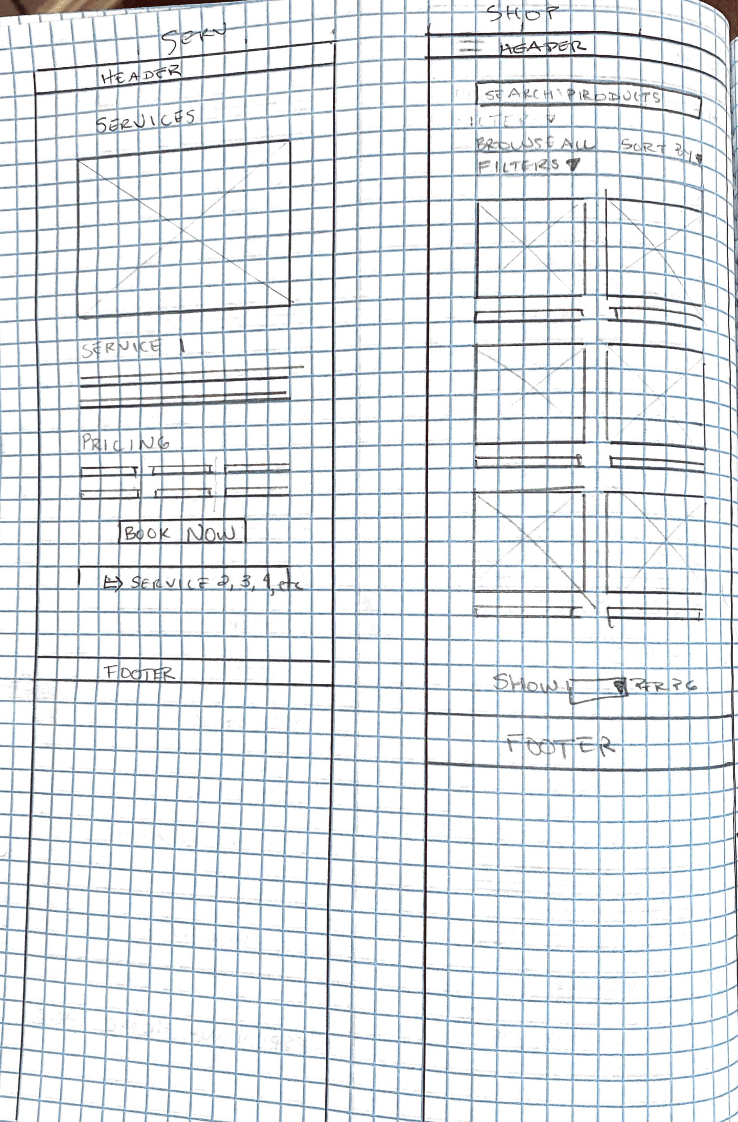
Using the information I could gather and references from other metaphysical shops, I formed a list of webpage essentials for a new and improved site. This includes a homepage, services page, online shop, contact, cart, checkout, and search page. I considered including a separate about page but decided the "about" section could be included on the homepage to reduce menu clutter. I reviewed several wireframes on Behance before beginning my sketches.
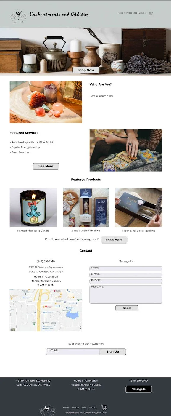
From there, I started sketching the header and footer to ensure the webpage had sufficient navigation for users. As the first page most users will see when they open the site, the homepage is the most important. I created a detailed list of items or features I wanted to include on the homepage. Since they are a store, I first featured a "Shop Now" button but included an "About" section above the fold for users to read about the shop. They offer services, primarily by the Blue Bodhi, but the shop only lists services in-store. Next, I added sections for "Featured Services" and "Featured Products" so users have the option to view and book services only, as well as peruse the most popular products. Both sections have a "See More" call-to-action button. Finally: location, location, location. The store is near a busy intersection and on the highway service road, but still inconspicuous. Most cars passing by on the busier streets won't notice the small shop, so including a location with a map is crucial for bringing in guests. I included a message form for customer inquiries and a newsletter subscription option as well.
I felt a services page would be great for users to read about the services offered and pricing options. These could also include an online booking page.
Their shopping page is relatively thorough, though it lacks a product search option. In the updated site plans, I kept the same shopping page but included the search option. The shopping cart appears on the right-hand side of the page after the user clicks the cart icon.
After selecting the checkout option, the user is directed to a more detailed cart page with product recommendations and updated order subtotal. Users can toggle between their cart, their shipping and billing information, and view an order summary before placing their order. Once the order is placed, the user sees a receipt confirmation page with their order number and more recommended products. For these pages, I followed an example by Jennifer Klayer on Behance and tweaked the template to match my site.
The contact page is simple but includes all necessary information. Again, I included the phone, address, hours, map, and message box for convenience. After finishing the wireframe sketches for the desktop site, I sketched the mobile wireframe.
To create a digital wireframe, I used the web presets on Adobe InDesign. Then, I added alternate layouts to the page for the tablet and phone wireframes and adjusted the size as needed. Once I had the skeleton for my site, I started filling in information and images. The shop doesn't have a logo, so I created one. I chose Gotham as the font for its simplistic, elegant style. The call-to-action buttons were too sharp as perfect rectangles, so I added rounded corners to soften their appearance. Then, I rounded the corners for the message and subscription forms.
Onto the email newsletter, I subscribed to five different metaphysical newsletters for research: Sage Goddess, Mystic Elements, Healing Crystals, The Mystical Moonstore, and Crystal Essence. Unfortunately, some of them were disorganized, some contained too much information, and others had both. For mine, I needed something simple and organized that highlighted the shop's features. So I created a header with the shop name and logo in my sketches, followed by the newsletter title. I used a simplified template with a primary article supported by four alternate articles.
Most of my subscriptions included a "stone of the week" article, so I wanted to include something similar in my newsletter. The shop's resident tarot card reader and energy healer extraordinaire is the Blue Bodhi, so I also had a snippet about her services. The shop featured a new product on their Instagram page a few months ago, but the Aura Crackle Quartz Crystal is stunning and worthy of inclusion in the newsletter. Recently, they hosted a photography session with Summer. Finally, they announced the return of their group meditation classes with limited capacity. The group meditation classes became the primary article for the newsletter since it has more potential for users to view and book.
This shop offered me tons of creative liberty in this project, but their sheer lack of online information was a massive roadblock. Their services list can't be found online, and most of their social media updates are weeks apart and outdated. They have a newsletter subscription on their website, but I haven't received a newsletter in my inbox yet.
Allabarton, R. (2021, August 6). 6 steps to make your First Wireframe [how to guide + video]. CareerFoundry. https://careerfoundry.com/en/blog/ux-design/how-to-create-your-first-wireframe/.
Cao, J. (2019, December 23). Website mockups: 4 popular approaches to explore. Creative Bloq. https://www.creativebloq.com/ux/3-way-create-website-mockups-11513936.
Costa, R. (2019, April 1). 30 inspiring web and mobile app wireframe examples. Justinmind. https://www.justinmind.com/blog/20-inspiring-web-and-mobile-wireframe-and-prototype-examples/.


