Taming of the Rogue
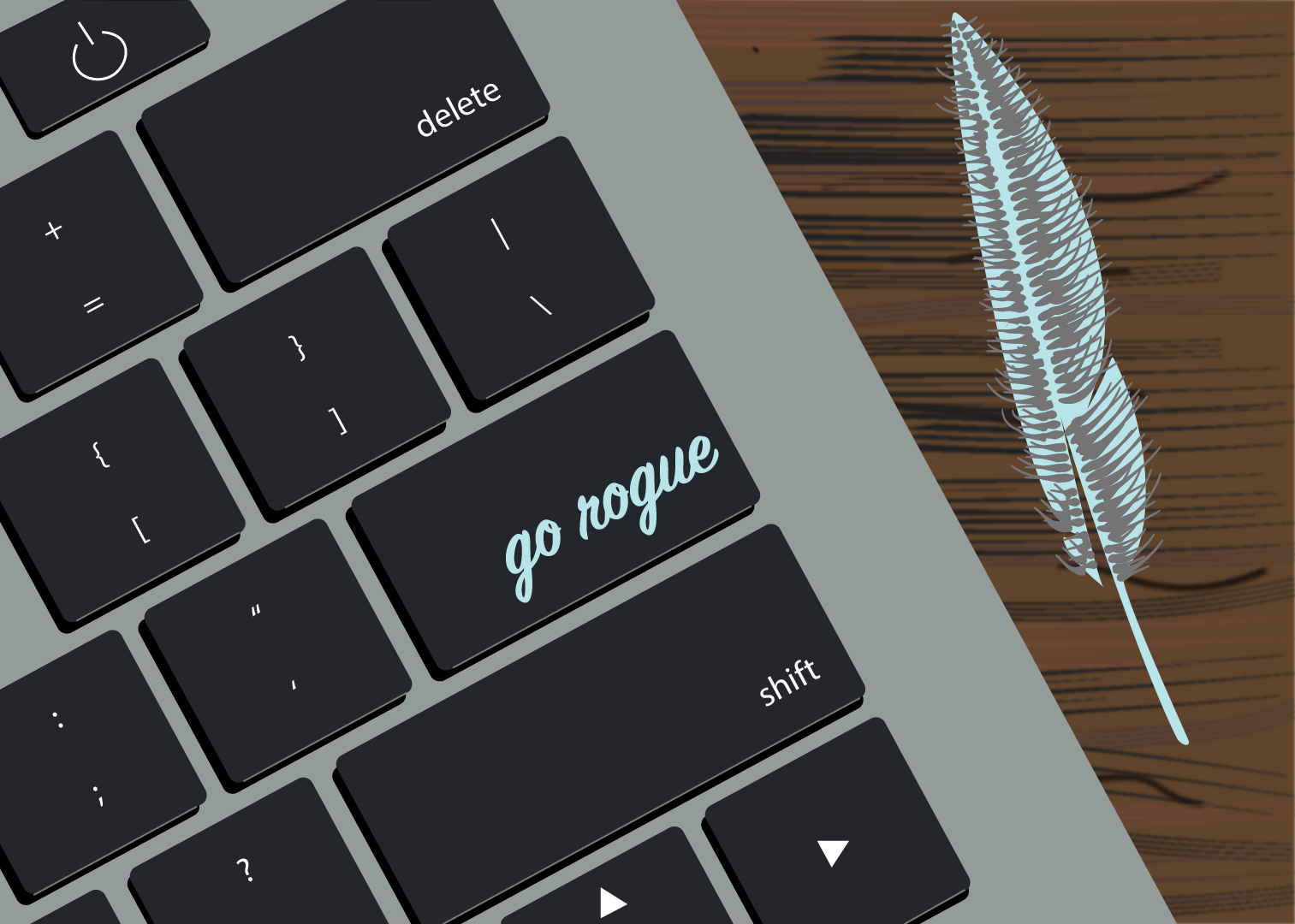
Nineteen posts later, it's time to start personalizing this blog. Since there wasn't a blog logo, I made my own: a simple cursive font with a feather pen at the end. I featured the unique logo at the top left of each site page instead of the simple site title. The logo gives the site a more cohesive and professional but personable feel. The old site icon was a traditional ink pen tip, but the feather is more rogueish and adds personal flair.
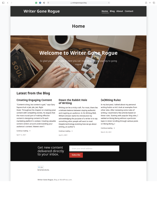
The WordPress site credit at the bottom was written out as "Blog at Wordpress.com," which was replaced with a simple but more professional WordPress logo. The footer now includes a navigation menu to help visitors find their way around without returning to the top of each page. Regardless, each page and post also has a new "Back to Top" button for accessibility. For personality, I changed the color palette from a standard red and black to blue and grey. I use blue, grey, and yellow for all personal websites, so changing it makes the website feel more comfortable and personable.
On the "Home" page, I deleted the unnecessary "Home" banner. Clearly, the landing page and the "Home" tab take visitors to the homepage. Initially, the site logo and main URL took users to the latest post instead of the homepage, but this seemed uncomfortable and confusing. Site logos conventionally link to the homepage so connecting to the newest post felt jarring. The homepage features the three latest posts but didn't offer image previews for these posts. Images draw more attention, and most readers seek a visual representation before diving into an article. Adding the image preview gives the site a more user-friendly experience.
The site URL ends with ".blog," so having a "Blog" page seemed redundant. I changed the "Blog" tab to a "Posts" page to clarify there are options for browsing blog posts. The image at the top of the original "Blog" page was the same featured image from the homepage. Since this distracts visitors from the blog posts, I deleted the image and added photo previews from each article. Adding the previews gives users a visual connection with each post's content and provides the website with a friendly feel. I changed the mobile settings for the "Posts" page, so each article stacked the image preview over the article excerpt instead of smushing the image side-by-side with the text to make the site more legible.
I didn't change the "Contact" page since it was already functional and straightforward. However, my portrait on the "About" page seemed disproportionately small compared to the site size, so I changed the thumbnail image to a larger photo.
I struggled the most with changing the site icon because the site consistently loaded with the old icon. After clearing my cache and browser history, then quitting Safari and shutting down my computer, the site refreshed with the new icon. I sincerely hope this information finds someone who needs it: know that it isn't you, it is Safari using old site memory.
I use the Morden theme from WordPress as the base for my blog, but this theme doesn't support dropdown menus. I would like to change the Posts tab to a dropdown menu for visitors to scroll through posts. However, a dropdown menu could be overwhelming with a more extensive list of posts. Leave a comment below to tell me what you think of the updates or what else I should update.


