
Mobile-First Information Architecture

What is Information Architecture?
Information architecture is geared toward enhancing user experience by organizing digital content. This structure builds a framework for content and helps users complete tasks effortlessly. An information architect considers many things, including content types, content quality, and relationships between content. The purpose is to make the overall product design feel intuitive, as if the user instinctively knows where to find the content they’re searching for.

Photo by ThisIsEngineering on Pexels.com
To do so, information architects first need to identify the product’s content and analyze the information for quality. Then, information architects can develop relationships between content types. Taxonomy, the practice of labeling categories, helps architects define groups of content. Later, the design’s taxonomy creates a more efficient navigation experience.
Why is Mobile-First Important?
Over the years, society has become increasingly dependent on mobile devices. In such a mobile-first world, information architecture must consider mobile navigation patterns. Mobile navigation seeks to help users search and locate content effortlessly. With advancements in technology, accessible information increasingly becomes a commodity that is rapidly expanding, updated, and published. Mobile users search for information unique to their goals and desires, but being mobile doesn’t change the rate at which users search for information.

Photo by cottonbro on Pexels.com
Information architecture develops a clear, cohesive order to a digital product. Navigation enhances the user experience with discernible search functions. The two disciplines function independently but work most effectively together.
Information architecture for mobile websites and applications has two main duties. First, to identify the content and functionality hosted by the mobile interface. Second, to define how different types of content and various functions relate to one another.
Within mobile design, information architecture and mobile navigation work best in synchrony. Valuable content may seem excessive and intimidating when combined with a noticeable lack of organization. Users in these situations may find themselves confused or frustrated and choose to leave the site.
Coordination between content and navigation creates an organized structure to benefit users with an interface that allows them to find what they want effortlessly. Information architecture considers all elements of content like navigation components, category labels and tabs, content hierarchy, and user expectations. A site with intuitive navigation to benefit users but poor aesthetics generates more positive reviews than a stunning site with terrible architecture and navigation that wastes time and energy.
Mobile-First Information Architecture Best Practices
Mobile screens are significantly smaller than traditional desktops, so unnecessary content should be erased or hidden under more important content. Conversely, essential content and information must be prioritized for accessibility.
On touchscreen devices, size and spacing affect how capable users are of interacting with target buttons and calls-to-action. For example, buttons that are too small can be frustrating when users accidentally click the wrong button, but overly large buttons require users to scroll and lead to reading fatigue.

Photo by Pixabay on Pexels.com
On-screen content needs to be legible. For example, content may appear proportionately larger on mobile devices than on desktop screens, but smaller screens are more difficult for most users to read.
Hand positions directly affect where navigation components live and the relationships between content and navigation. In general, it is good practice to ensure important features are accessible within the reach of one hand.
Finally, users despise entering data on mobile devices, such as login information, sign up forms, or other information fields. Data input should be reduced to the bare minimum to maintain a good user experience.
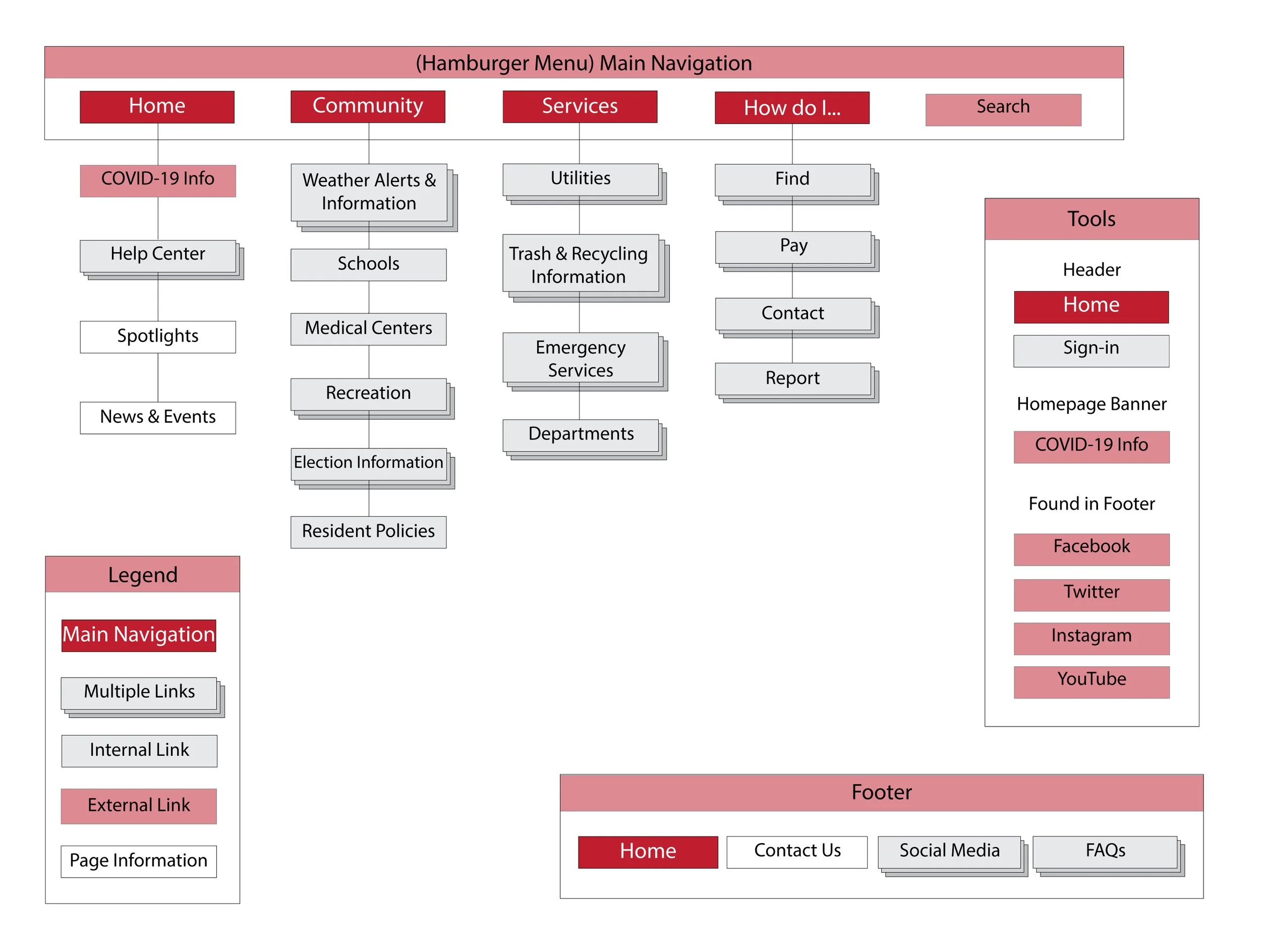
Under Construction: Example Continued
In the previous blog, I discussed more about information architecture and provided an example of my hometown’s sitemap. I also developed a more intuitive sitemap to improve site functionality. Here, I added a companion mobile app for the city’s proposed information architecture.
Below on the left is a sitemap for the current City of Owasso’s webpage. The information architecture is scattered, complicated, and overwhelming. With a simplified design and consolidated links, the proposed sitemap (below on the right) offers a more user-friendly approach.
For the companion mobile app, I decided to create a hamburger menu for the main navigation. When clicked, the menu opens on the right side of the screen and offers “+” buttons to indicate there are more options within each of the main navigation labels. The main categories drop down to reveal what further information can be found on those pages.
Instead of a banner on each page for COVID-19 safety information, I decided to create a block at the top of the homepage. Below this, the homepage will host the same information as the desktop website. For most residents, the information offered on the desktop site would still be relevant on a mobile app but I further consolidated the available buttons under the Community tab. Facilities would then host the Schools, Medical Centers, and Recreation links.

A link to the homepage and a banner for users to sign in would be available in the header of each page. The footer would host a link to the homepage, contact information, links to social media, and FAQs. I moved the search tool to the hamburger navigation menu to avoid overcrowding the page banners.
Later, I narrowed down the mobile app features further to accommodate users on small screens. I removed links to forms and applications since most mobile users don’t want to fill in form fields on mobile devices. Instead, I chose to focus more on Community and Services by removing the Government and Business tabs. I added the Services tab to simplify the upper levels of navigation.
Previously, I combined Schools, Medical Centers, and Recreation into one subpage labeled “Facilities,” but it was noted that many people wouldn’t initially think to look under Facilities for School information. I also moved Election Information and Resident Policies from Government to Community, since they are links some users might search for on the go. Departments were initially under Government, but I moved it to Services for quick reference.
When traversing digital products, users must feel comfortable and capable. Websites are rapidly changing to responsive designs to accommodate an increasing amount of mobile traffic. Users expect a design that formats to their device for ease of use. Many sites also create companion apps for user convenience and efficiency.
Within mobile apps, organization and flow are critical to prime user experience. A poorly structured design and difficult navigation lead to user frustration and some users may abandon the app altogether. Users who find the content they’re looking for quickly and easily are more likely to return to the app and recommend the app to others.
The City of Owasso’s website can be found at www.cityofowasso.com. Owasso has an affiliated business development website located at www.chooseowasso.com.
Babich, N. (2020, November 24). The Beginner’s Guide to Information Architecture. Ideas. Retrieved April 3, 2022, from https://xd.adobe.com/ideas/process/information-architecture/information-ux-architect/
Bowers, M. (2020, October 13). Information Architecture Principles for Mobile. Toptal Design Blog. Retrieved April 3, 2022, from https://www.toptal.com/designers/mobile-ui/information-architecture-principles-infographic
Brown, D. (2010). Eight Principles of Information Architecture. Bulletin of the American Society for Information Science and Technology, 36(6), 30–34. https://doi.org/10.1002/bult.2010.1720360609