
Go Ask Gordon: Branding

Go Ask Gordon is a distinctive personal brand centered around mysticism, curiosity, and knowledge-sharing through a modern witchcraft lens. Developed for a content creator and spiritual educator known as Gordon the Man Witch, the brand was built to evoke the atmosphere of candlelit study sessions and magical mentorship. Designed for his weekly event series, Witchy Office Hours, the branding system merges dark academia aesthetics with witchy charm to create a visual identity that feels both scholarly and supernatural.

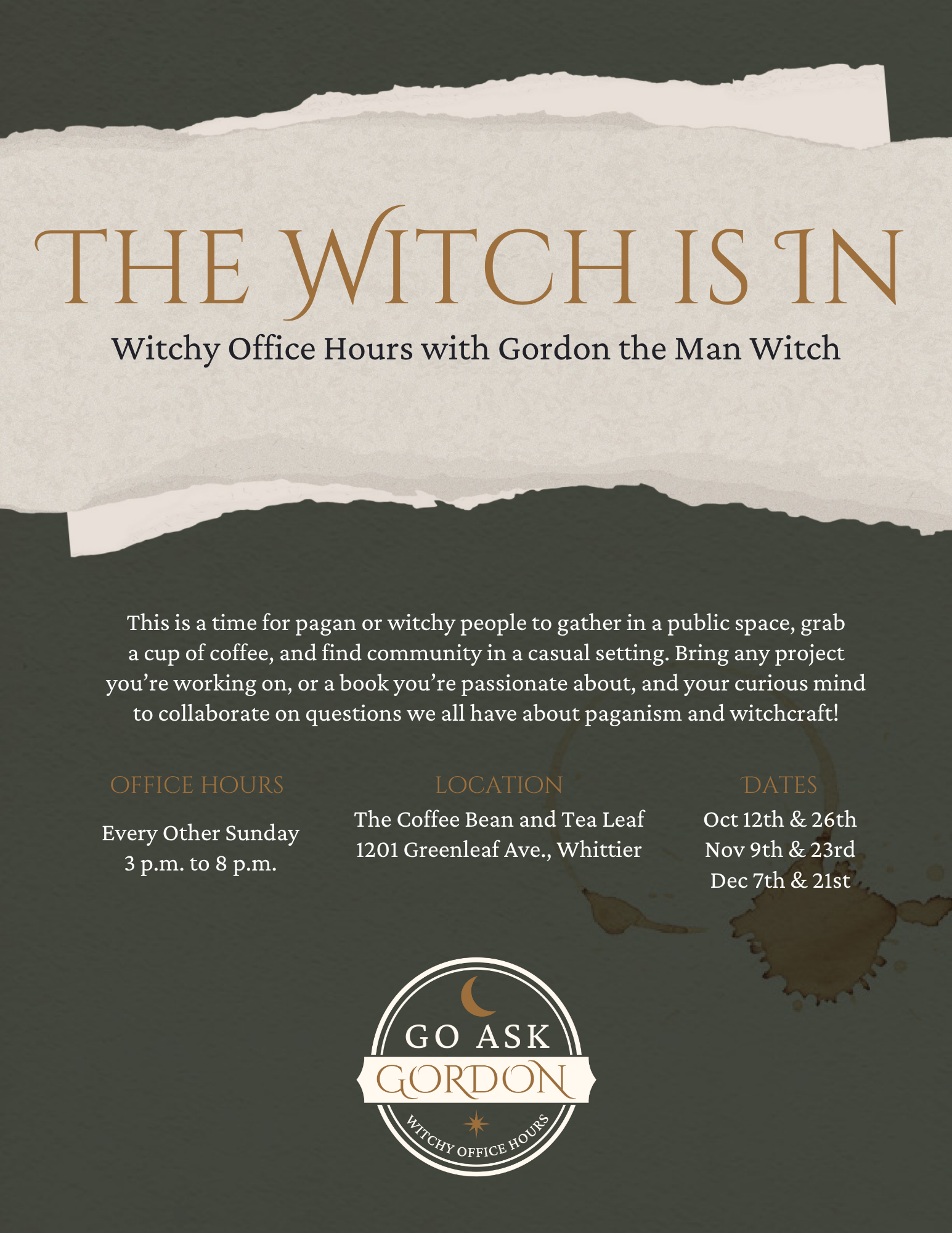
Witchy Office Hours

The concept for Go Ask Gordon originated from Gordon’s mission to create a welcoming, mystical space where seekers could explore magic, folklore, and intuition. Drawing from symbols of wisdom such as old books, celestial illustrations, and alchemical markings, the visual language reflects his balance of intellect and enchantment. The tagline “Witchy Office Hours” captures this duality, presenting Gordon as both the academic mentor and the modern mystic, bridging the gap between the occult and the accessible.
Concept
The design direction combines dark academia tones with arcane, antique motifs to ground the brand in intellect, mystery, and ritual.
Primary Color Palette: Deep earthy green (#43473F), ink black (#231F20), parchment ivory (#FFF9F0), and tarnished gold (#9D6F3C), evoking candlelight on aged paper and the atmosphere of an old library.
Typography:
Primary Serif: Cinzel Decorative chosen for its refined, classical elegance and subtle gothic flair.
Secondary Serif: Crimson Pro used for body text and subheadings to maintain readability while preserving the scholarly tone.
Logo Design: The logo suite includes two emblem variations, all built around Cinzel Decorative typography and iconography such as moons and stars. Each version reinforces the brand’s narrative of intellectual magic and creative exploration.
Visual Identity
Mood & Inspiration
Inspired by candlelit studies, arcane libraries, and celestial cartography, the brand’s tone feels mysterious yet learned. Textures of aged parchment and hand-drawn symbolism support the idea of a modern-day scholar of the occult. The aesthetic blends gothic refinement with witchy intrigue, an invitation to both think and feel deeply.
From Brand to Collateral
The primary objective for this project was the creation of a cohesive flyer system to promote Witchy Office Hours. Each flyer was designed to balance mysticism and clarity, pairing vintage botanical illustrations, celestial details, and dramatic serif typography with consistent color treatment. The layouts were optimized for both print and digital use, ensuring strong readability while maintaining the brand’s signature tone of “elegant enchantment.” Supporting assets such as social graphics and event banners were adapted from the core visual identity to create a seamless, recognizable presence across platforms.
Social Media Templates


